

A thoughtful redesign to ThreatQ’s product release notes
Role
Lead Designer
Project Duration
4 Weeks
Read Time: 3 min
Project Overview
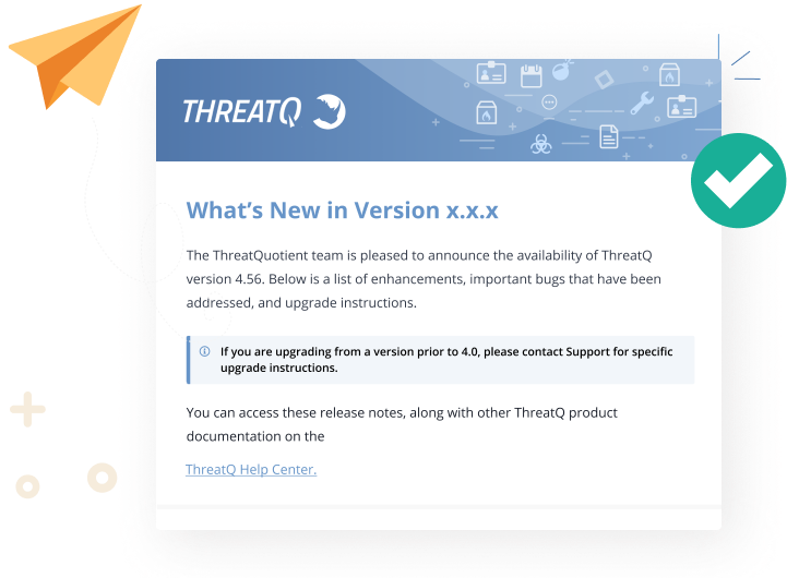
Picture this: at the end of each release cycle, like clockwork, our product release notes are sent to our customers. This serves as a sneak peek into what's in store when upgrading—the first line of defense to leave an impression and drive the adoption of new features and functionality. With that understanding, release notes can play a pivotal role in your product's success. So, when I was approached to lead the initiative to redesign our platform's release notes, I recognized the need for more than just an update. This would be an extension of our product, requiring a design thinking framework to ensure a straightforward and user-friendly experience.
My goal was to design a template that:
-
Enhanced customer retention
-
Boosted readability
-
Streamlined information for quick and effortless browsing
The Problem
Threat Quotient is a cybersecurity platform that offers various product offerings. These parts of the platform often featured a mix of bug fixes, feature enhancements, and new known issues. This information was often intermingled, posing a challenge in distinguishing one from the other.
On top of that, there were additional sections that had lengthy descriptive paragraphs without any clear hierarchy or separation between them. This resulted in scrolling fatigue, high drop-off rates, and increased customer support engagement.

Research
I opted for qualitative methods during the research phase, collaborating closely with our tech publications and customer support teams to guide my design decisions. The objective was to understand what information our customers deemed essential and discover best practices for crafting and consuming release notes.
Key Takeaways
Information Priority:
Customers expressed a clear preference for having new features documented upfront. They also wanted to understand how the upgrade would impact them
Scannability Matters:
Users tend to scan through release notes, and if these notes consist of lengthy, unformatted paragraphs, there's a high likelihood they won't be read.
Simplicity in Language:
It became evident that using simple language and avoiding unnecessary technical jargon was crucial for retention.
Clarity is Key:
The overarching theme was the importance of clarity. Whether it's about the impact of an upgrade or the details of where these bug fixes/features apply on the platform, users demanded clear, easily digestible information.
Scannability Matters
With the many sections our release notes could have, the biggest issue I had found with our current offering was that it was hard to distinguish one section from another. When thinking about the redesign, my primary focus was ensuring effortless scannability.
The Aim - Users should be able to quickly find the information they are looking for within a single scroll.
To address this, the first design element I introduced was clear section dividers. These worked as a visual aid to help distinguish one section from another.

I added a blue vertical line to the section headers that held critical information such as Install Notes and Upgrade Instructions, in order to easily distinguish these sections from our product update. Our customers do not upgrade upon initial release and tend to review these notes several weeks later.
By providing a visual identifier, users can easily find the information they are looking for, no matter how lengthy the release notes could be.


The next section I tackled was how we would structure product updates, a.k .a. what our customers like to call the meat of the release.
Initially, this section was broken up into three categories: New Features, Notable Bug Fixes, and New Known Issues. The problem here was that we offer four different product offerings, and users were finding it difficult to distinguish where in the product these features and bugs were referring to.
On top of that, our customers have different licensing packages, which means not all our customers have access to all areas of the platform. This formatting required additional effort from our users to pinpoint the information that pertained to them.

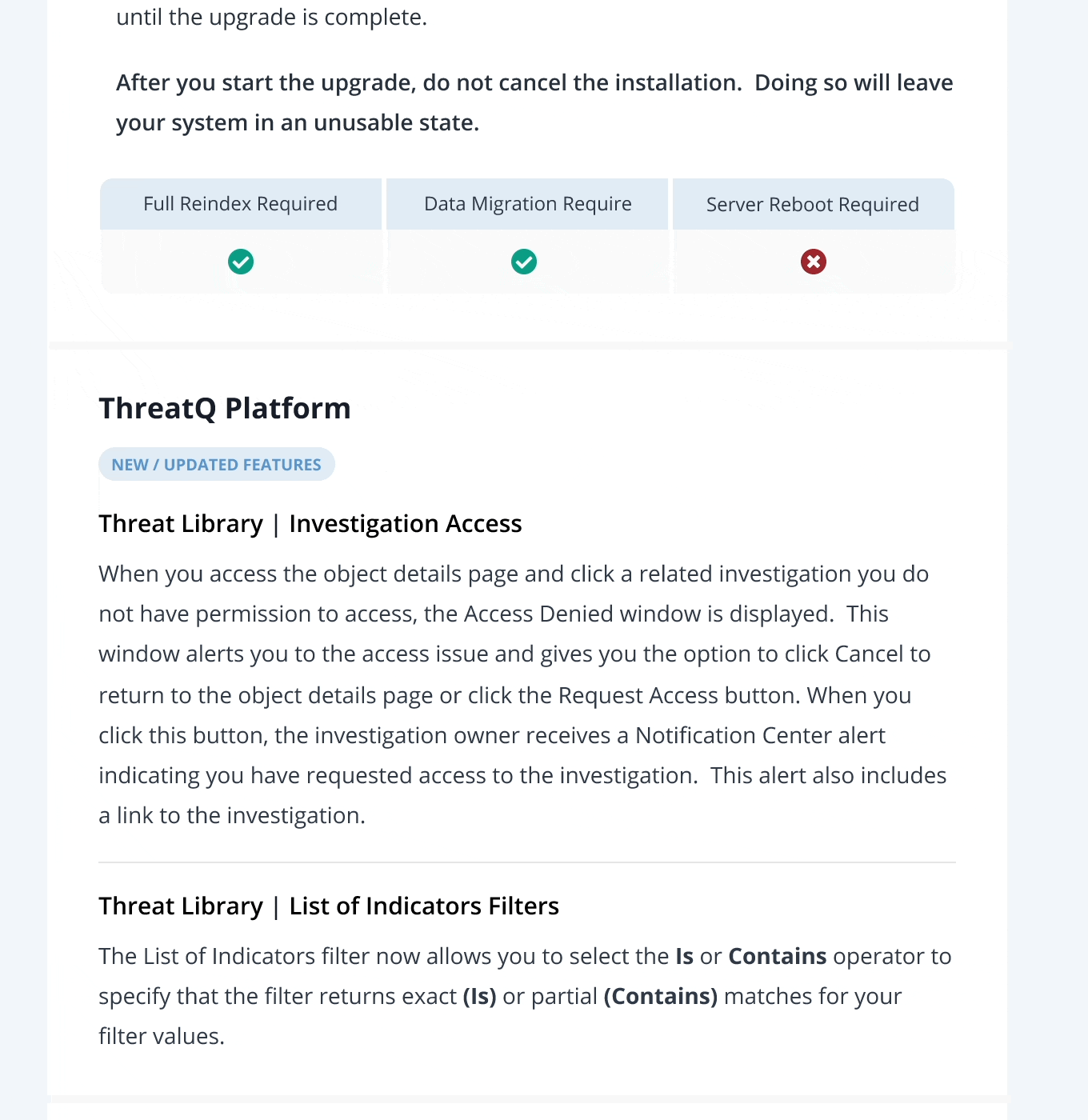
To reduce information overload and improve ease of readability and scannability, I restructured this section, organizing it around the distinct product offerings
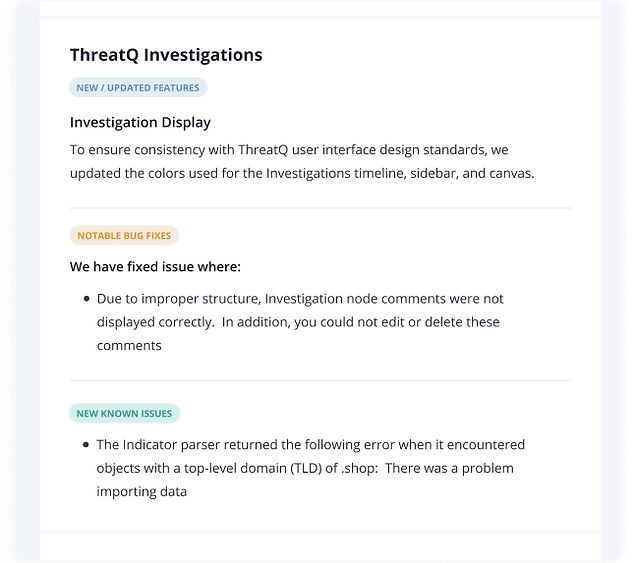
Now, each product had its own dedicated section, with the original categories repositioned as subcategories beneath each specific product.
By streamlining the information into product-categorized groups allowed for a more intuitive user experience. Users could now navigate directly to the relevant product section, minimizing the time and effort required to find pertinent information.

In addition, I implemented color-coordinated pill labels to represent various subcategories within the product sections.
This strategic use of color serves as a visual anchor, reducing cognitive load when navigating through substantial chunks of text. The color-coded labels act as a navigational guide, simplifying the process of scanning and finding relevant content within each product section


Conclusion
My primary objective in designing this template was to enhance readability and increase the read-through rate, which, for me, began with a deep understanding of how to effectively group and display information. I took what was a long page of text and gave it life through thoughtful visual design elements and logical grouping. I learned what was important to our customers and created a template that not only delivered information but allowed for that information to be retained.
The impact of these design changes was notable, with ThreatQ experiencing a remarkable 58% increase in page hits and an additional 39 seconds in read time compared to the notes prior to the design enhancements.